PEAK SOCIAL TONICS
Peak has set out to challenge the drinking culture and pioneer a new and healthier way to socialise.
Peak Social Tonics
Branding, Packaging, Illustration
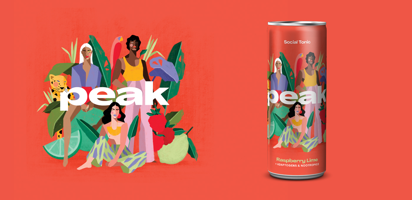
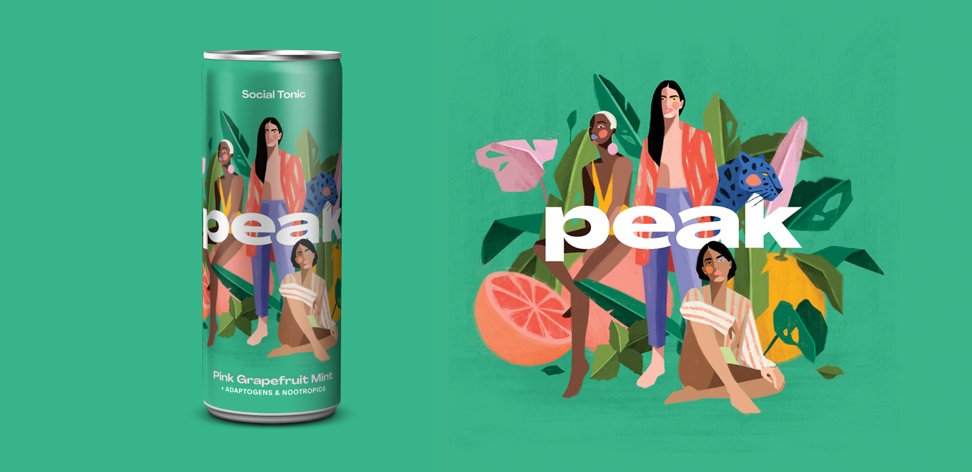
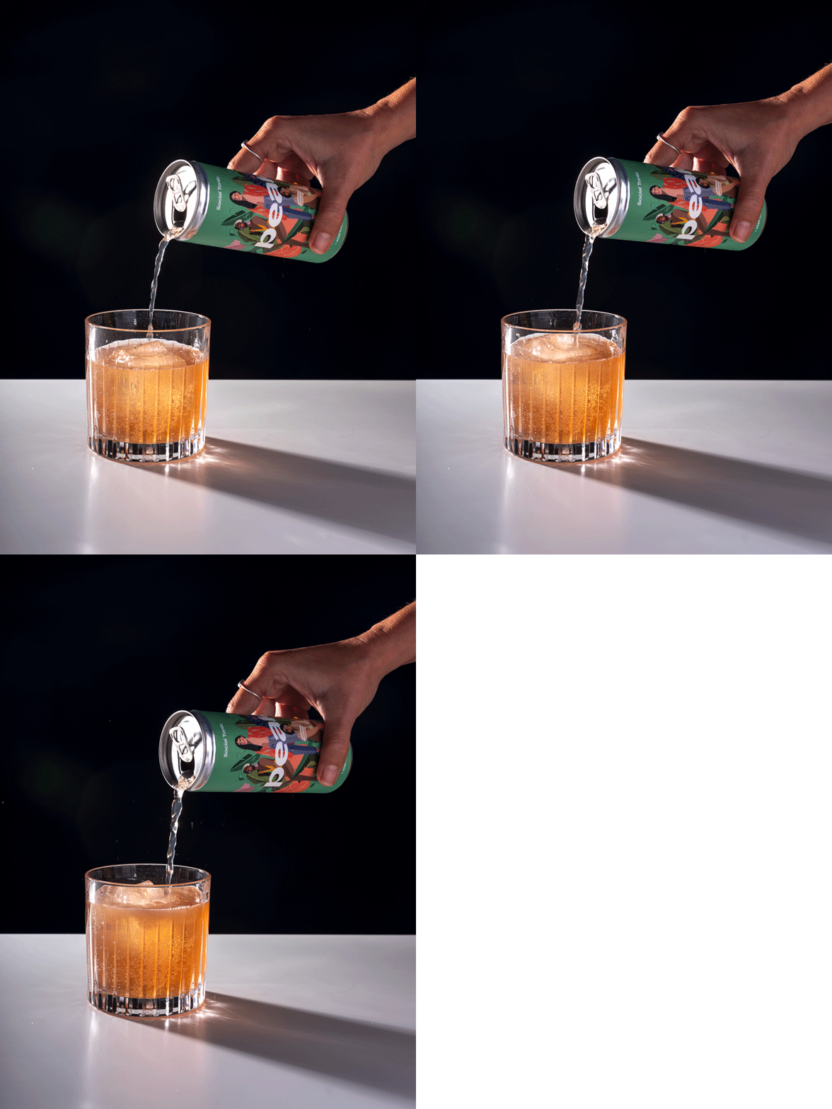
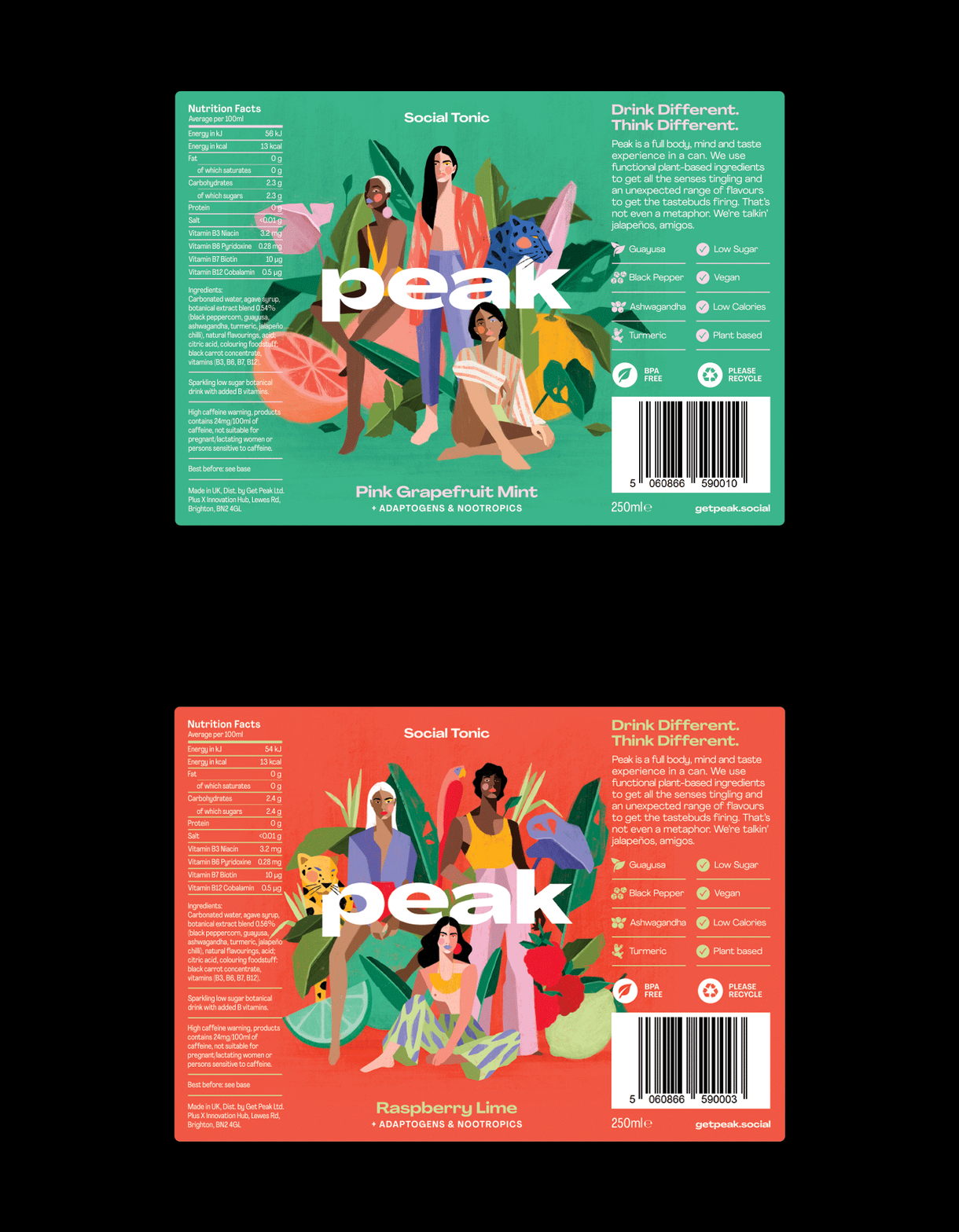
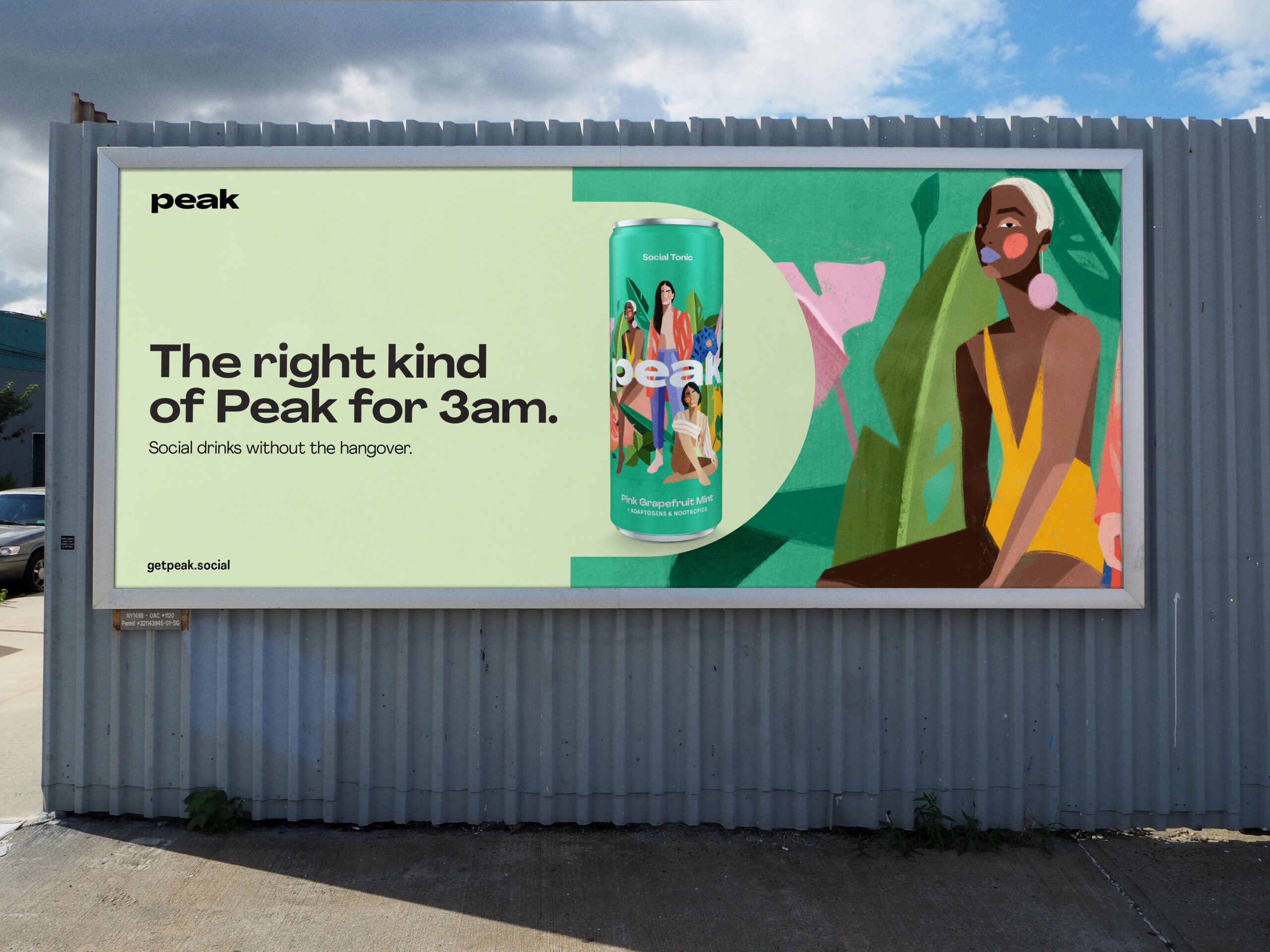
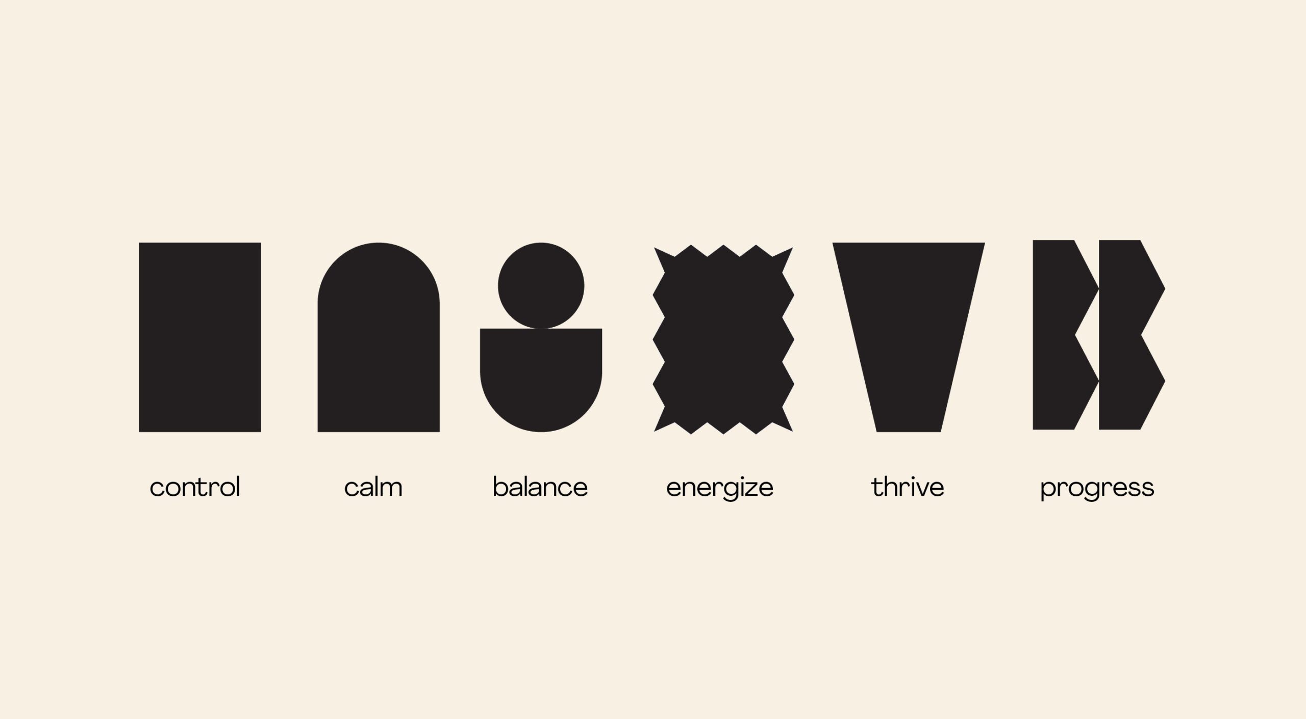
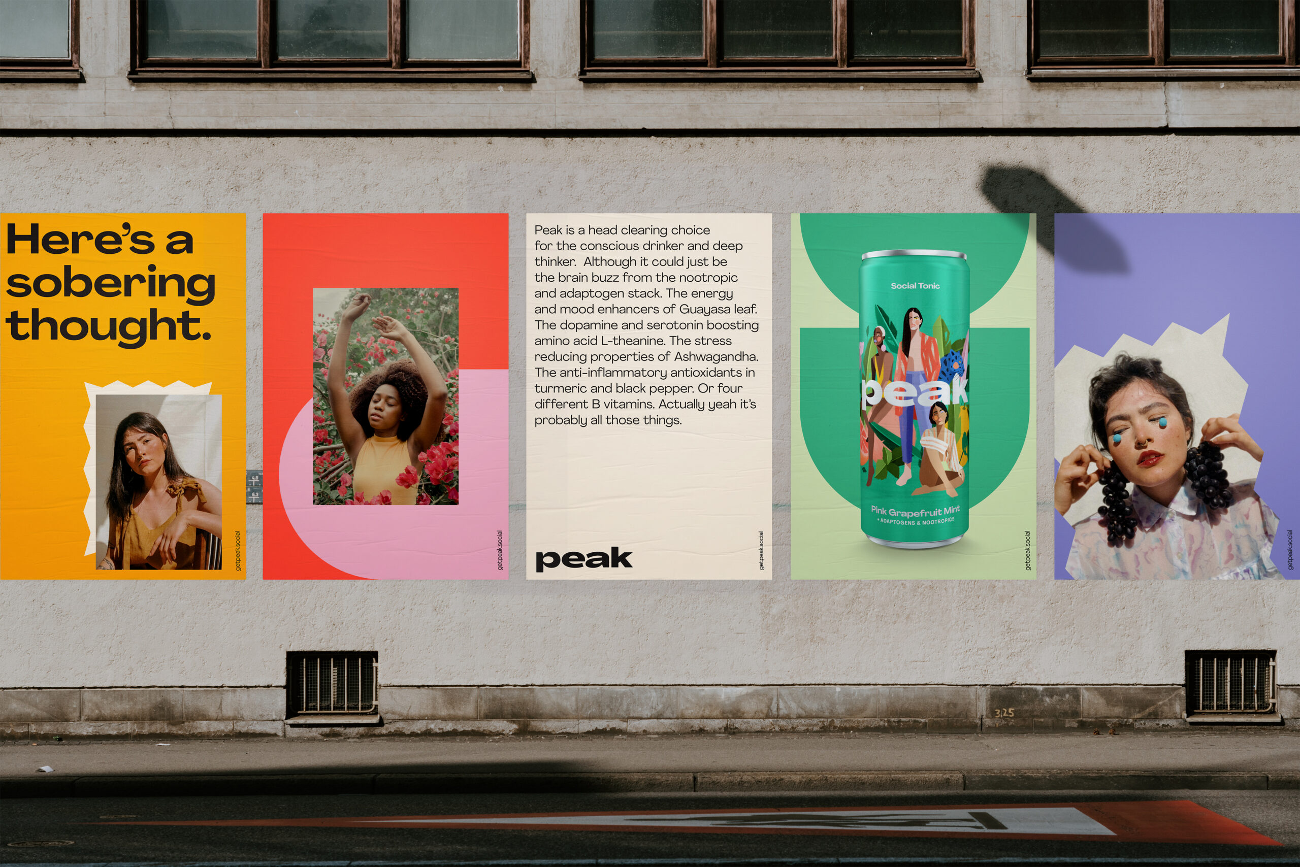
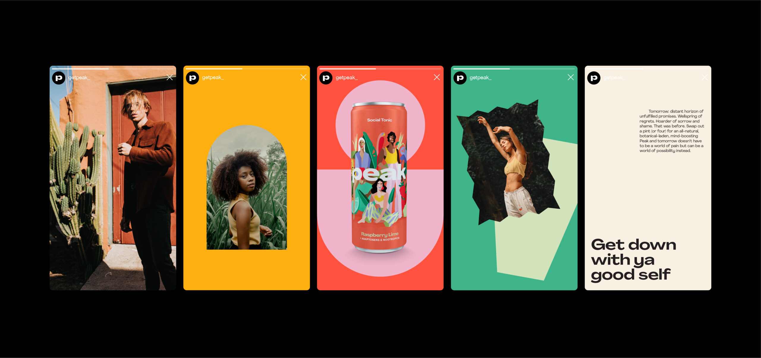
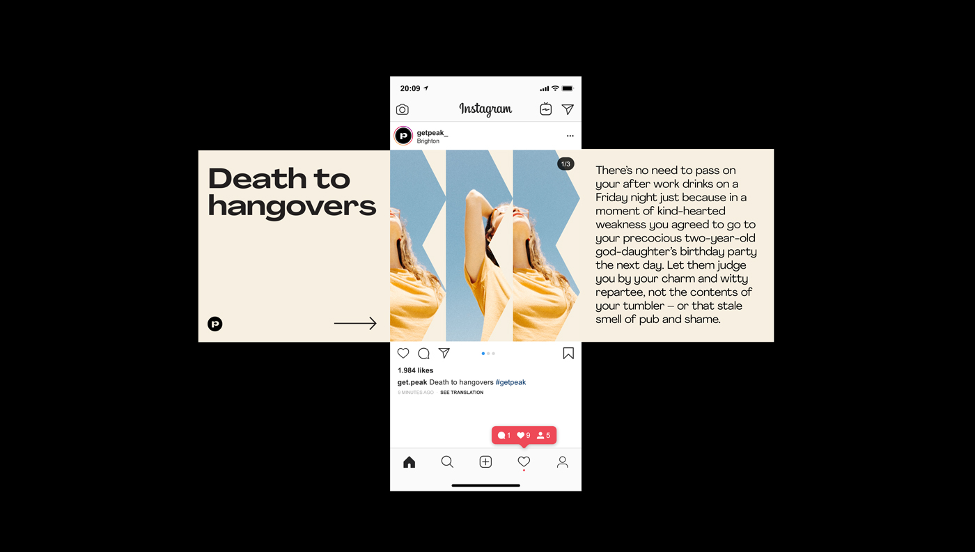
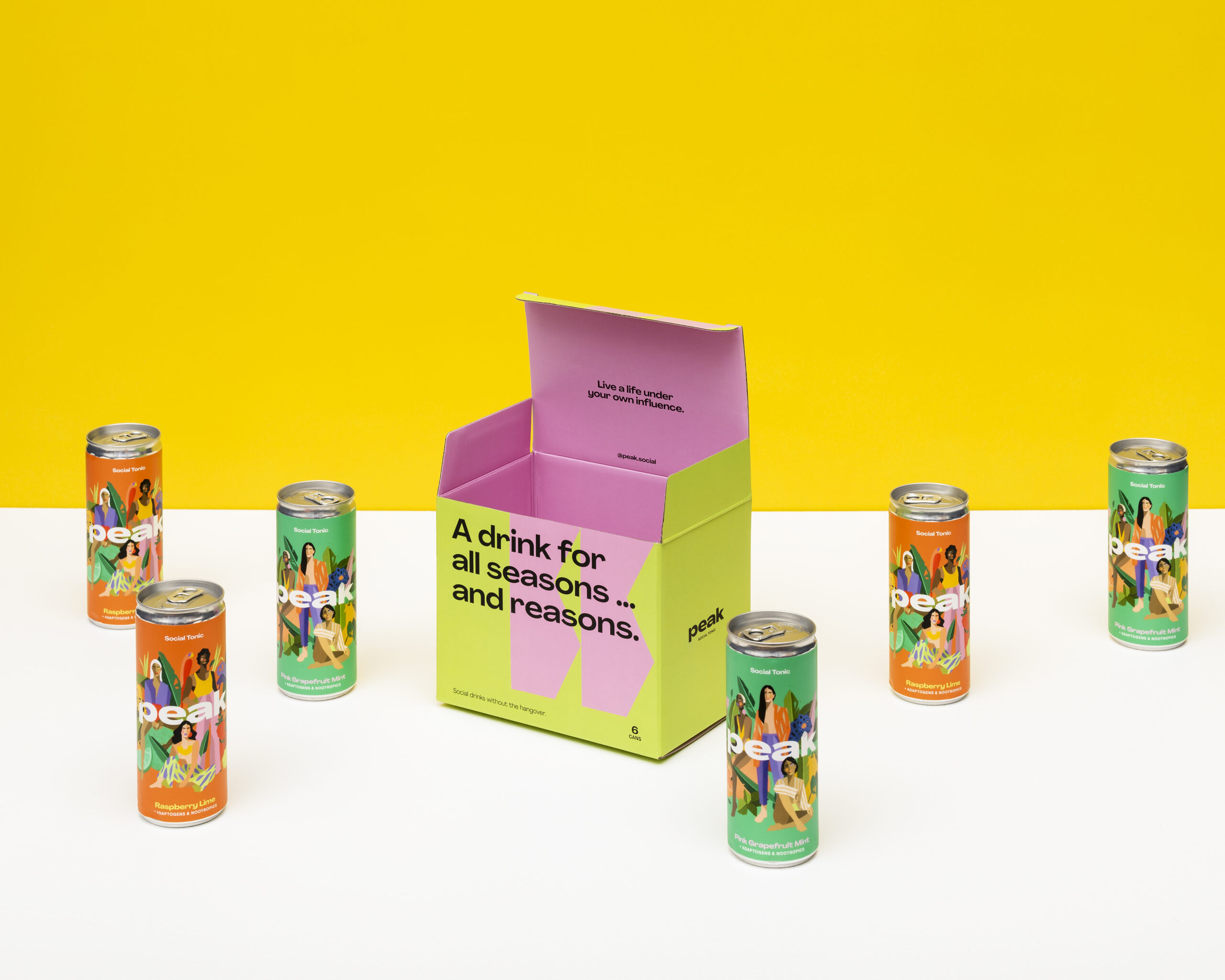
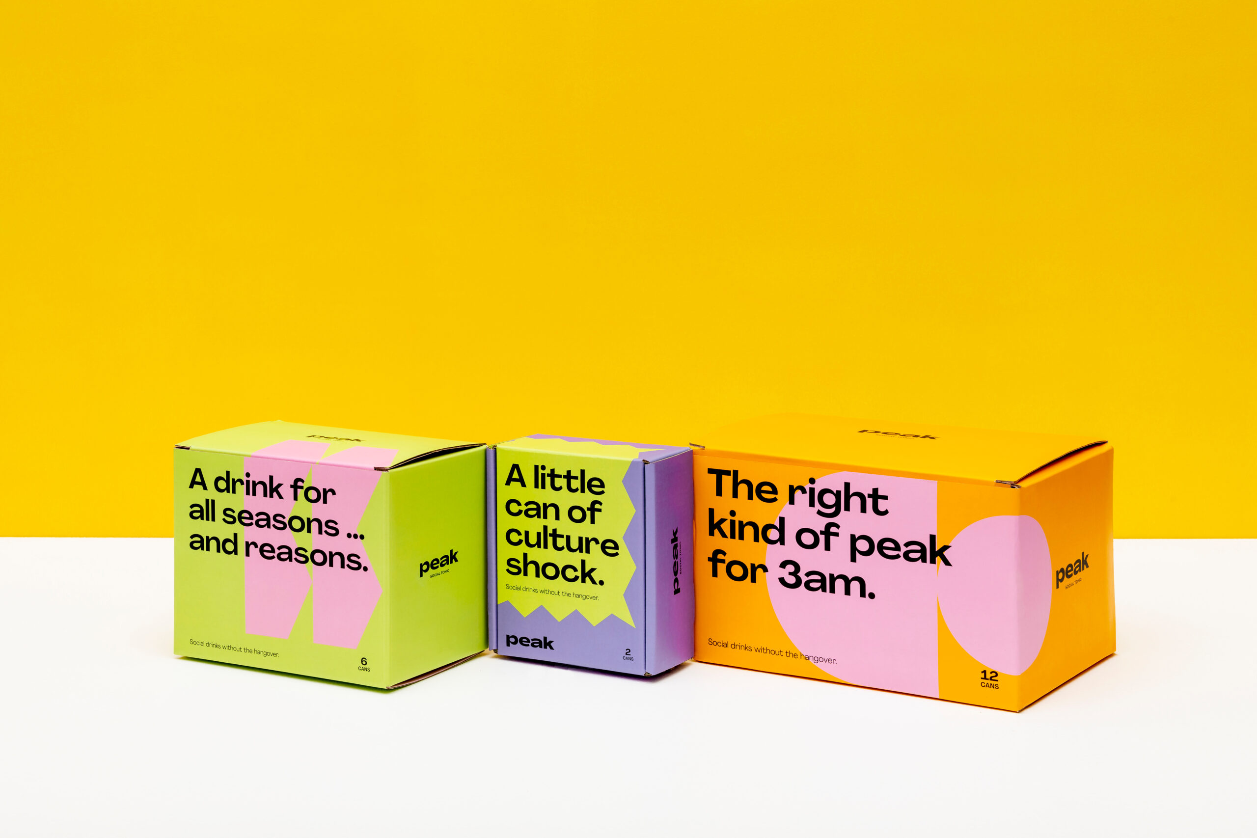
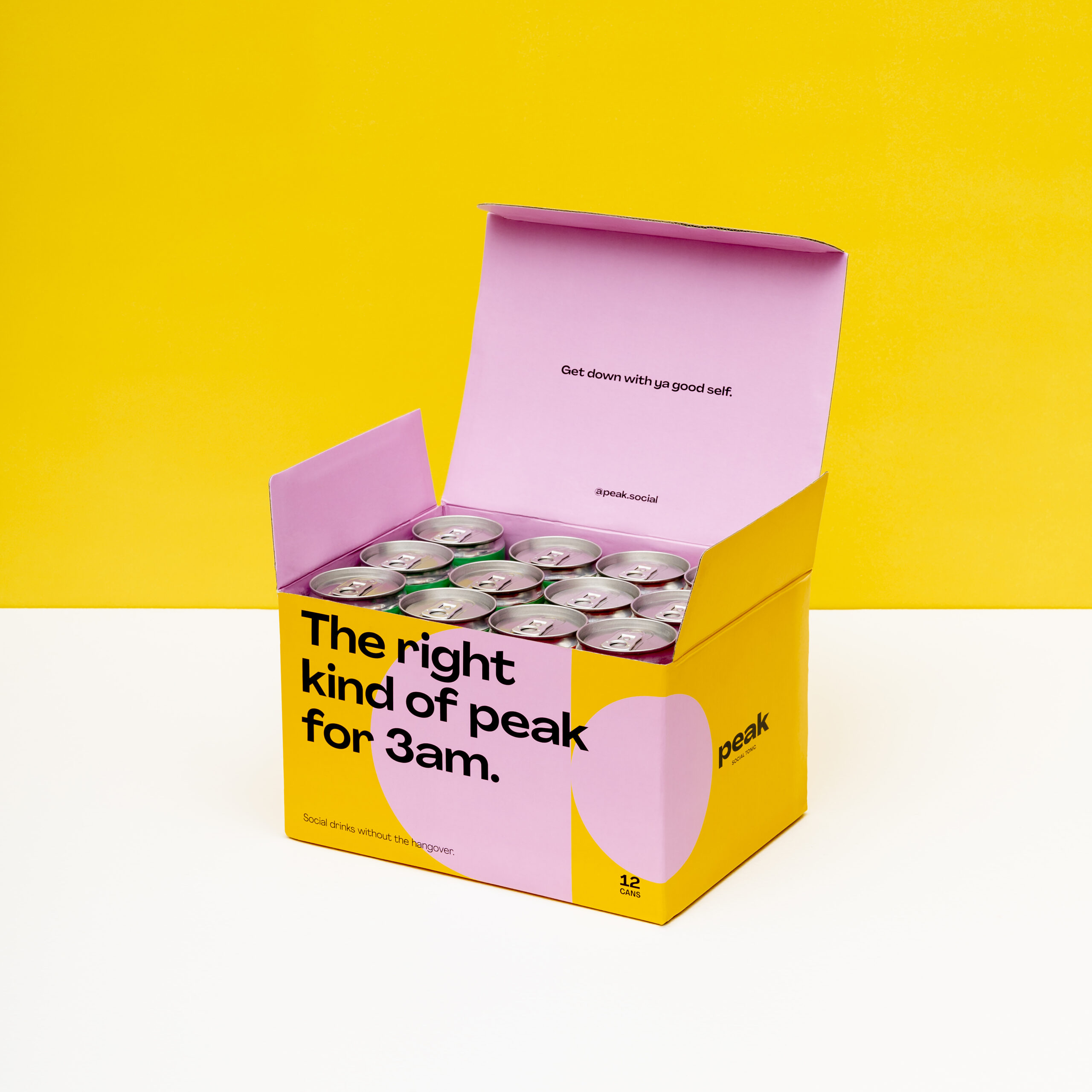
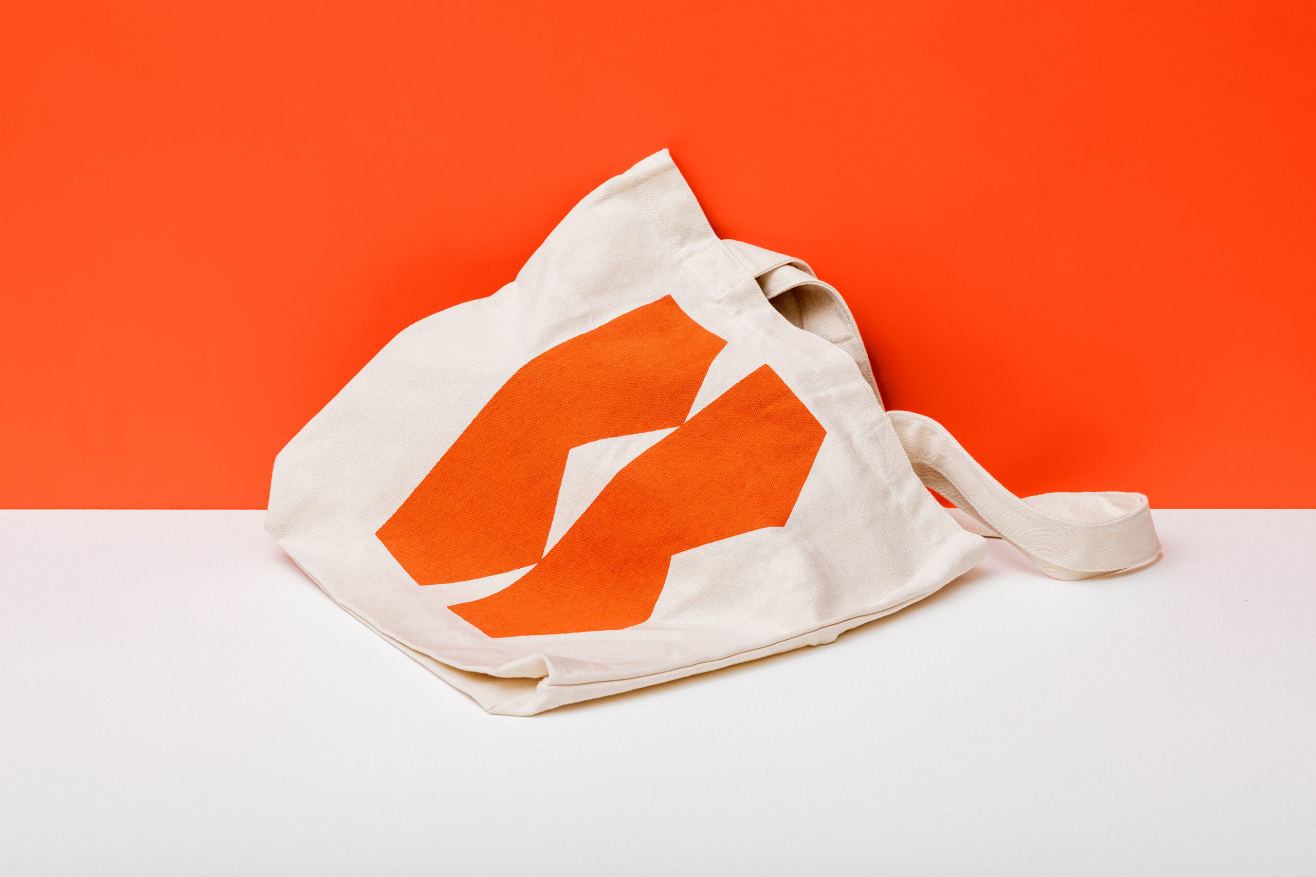
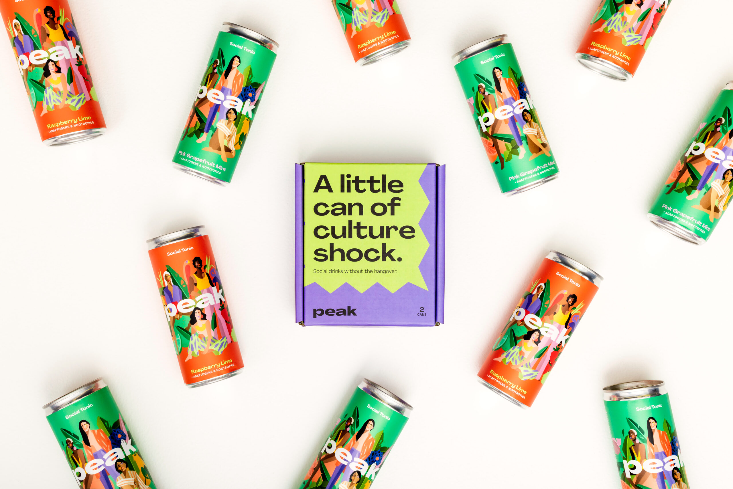
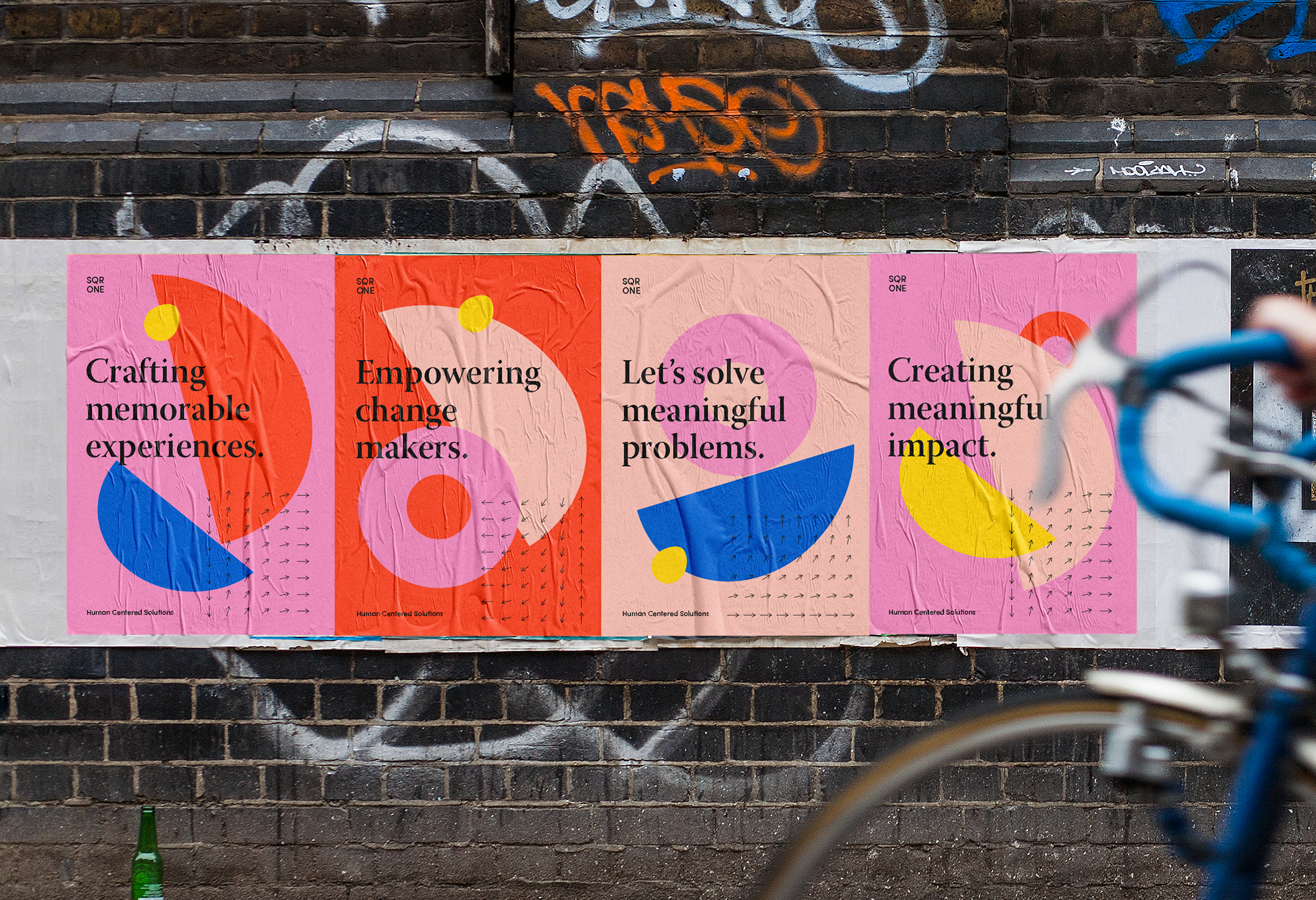
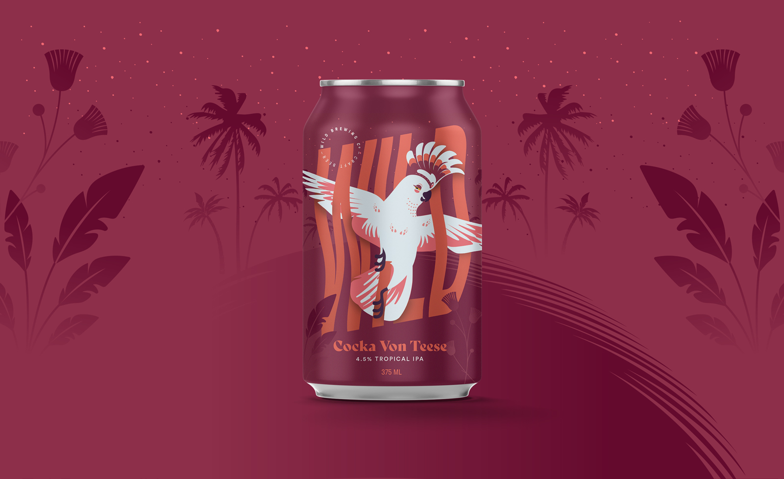
Peak has set out to challenge the drinking culture and pioneer a new and healthier way to socialise. With this in mind, the brand was designed to be daring, empowering and exciting. The playful colour palette was inspired by the natural ingredients of the drinks, while the shapes represent the way Peak makes you feel—whether that be balanced, energised, or simply in control. These were paired with illustrations that embody what the Peak culture is all about — a brand that’s not afraid to be different.
Words by Apostrophe
Illustrations by Oscar Torres
